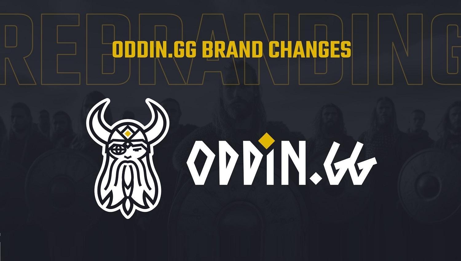
The reimagined logo addresses practical issues caused by its complexity, offering a cleaner, more versatile design. Reduced lines and a streamlined look ensure the logo is recognizable and impactful, even in smaller applications. It's also more in line with the Norse style of Vikings, a base of the overall Oddin branding.
At the heart of the new design is the integration of the rune 'O', a symbol rich in history and meaning, and of course a symbol of Odin, the God. The motif extends beyond the logo, serving as a versatile standalone emblem representing Oddin.gg's brand, becoming one of its key assets.
There are multiple new assets the brand introduces in its inventory, such as the shield and ravens, with each of them being rooted in Norse mythology. However, as the brand operates in the utmost modern environment, working with such tools as machine learning and artificial intelligence, there are both allusions of and technological means used in the branding.
In keeping with the theme of cultural depth, the brand has introduced a custom-made font inspired by runic texts. This font not only complements the logo but also reinforces Oddin.gg's commitment to blending historical elements with contemporary eSports culture.
“Oddin.gg's refreshed logo is not just a visual change but a representation of the brand's ongoing evolution. This rebranding arms the brand with tools needed to stand out as the company continues to make its mark in the ever-evolving world of eSports and iGaming,” concludes the company.
Source: GMB